10
years in Ecommerce
sales@cart-power.com
HomeCase StudyFloristeria — Flower and Gifts Delivery

Floristeria —
Flower And Gifts Delivery

High loading speed of pages with a large number of products

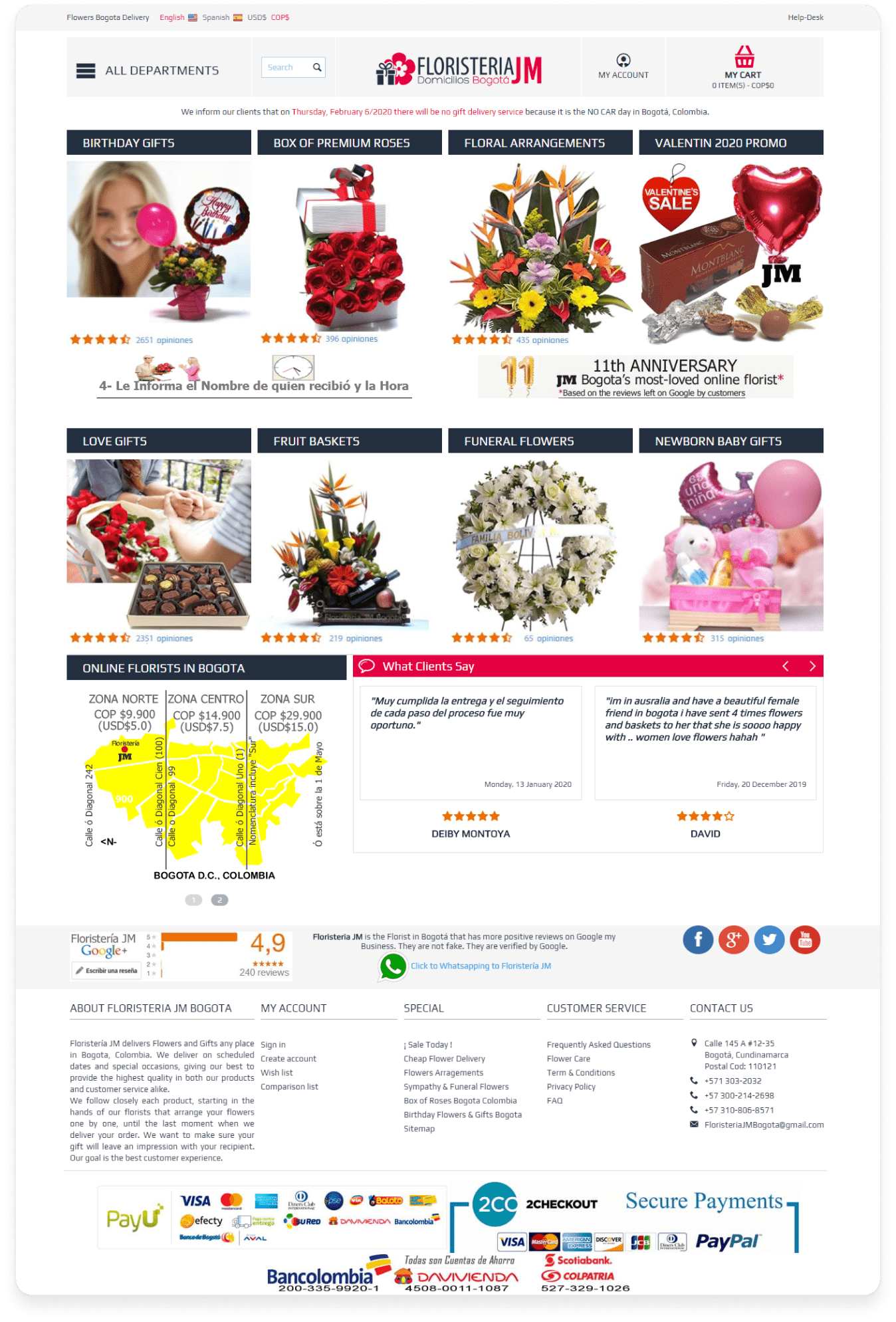
Floristería delivers flower and fruit bouquets, baskets of sweets, and gift arrangements in Bogota (Colombia). Each order contains fresh flowers or sweets, so the project’s feature is a fast delivery to anywhere in the city. The client has two websites: Floristería’s own online store and the BogotaCompra marketplace, where Floristería brand is present as one of the vendors. We made all the improvements in the same way for both websites.

Floristeria логотип

Field: sale and delivery of flowers and gifts   Country: Colombia   Website Floristeria

Floristeria главная

Main goals

Our work process

1. We added the ability to create cards with unique wishes for each order
Floristeria карточки-открытки

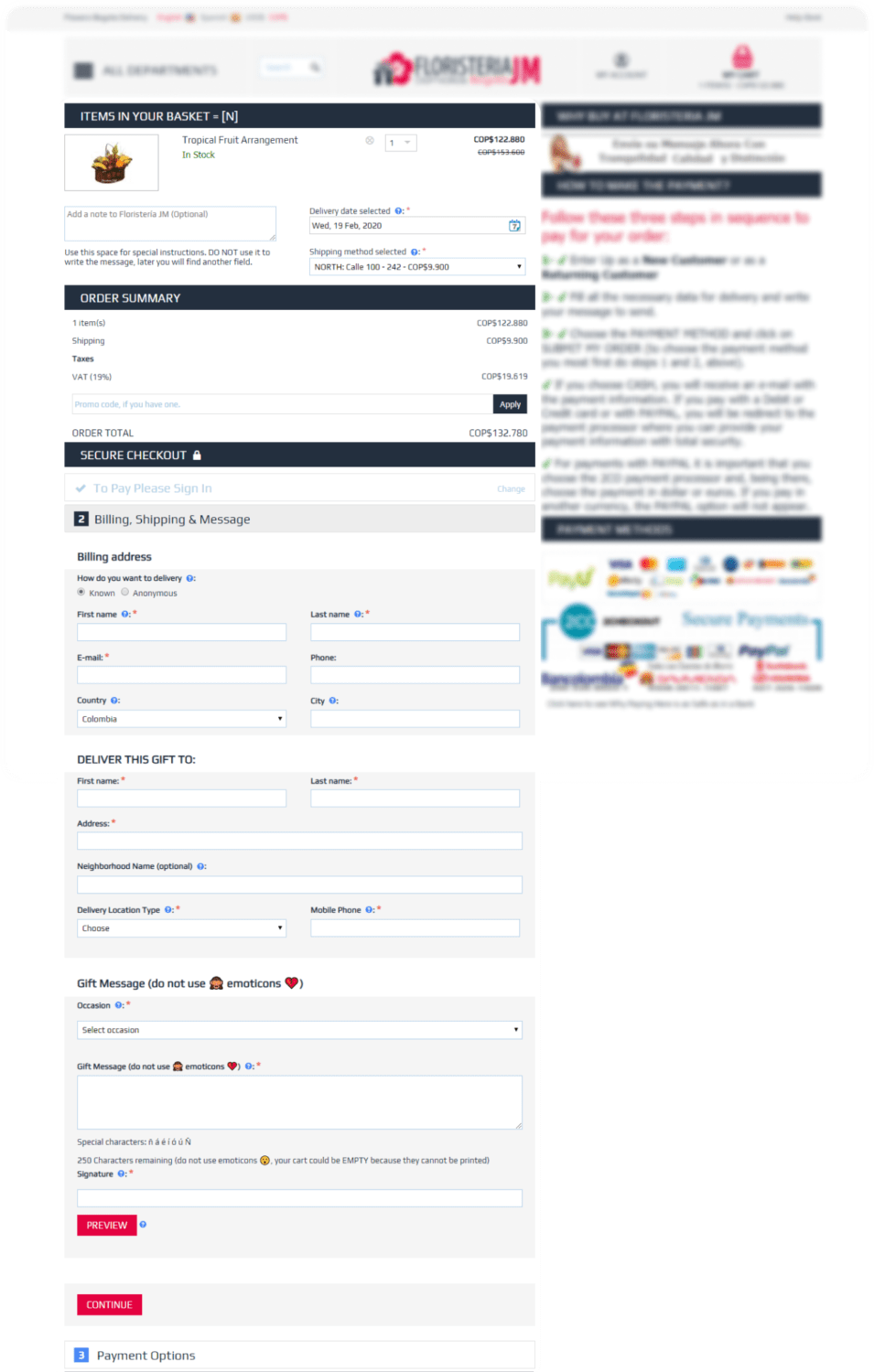
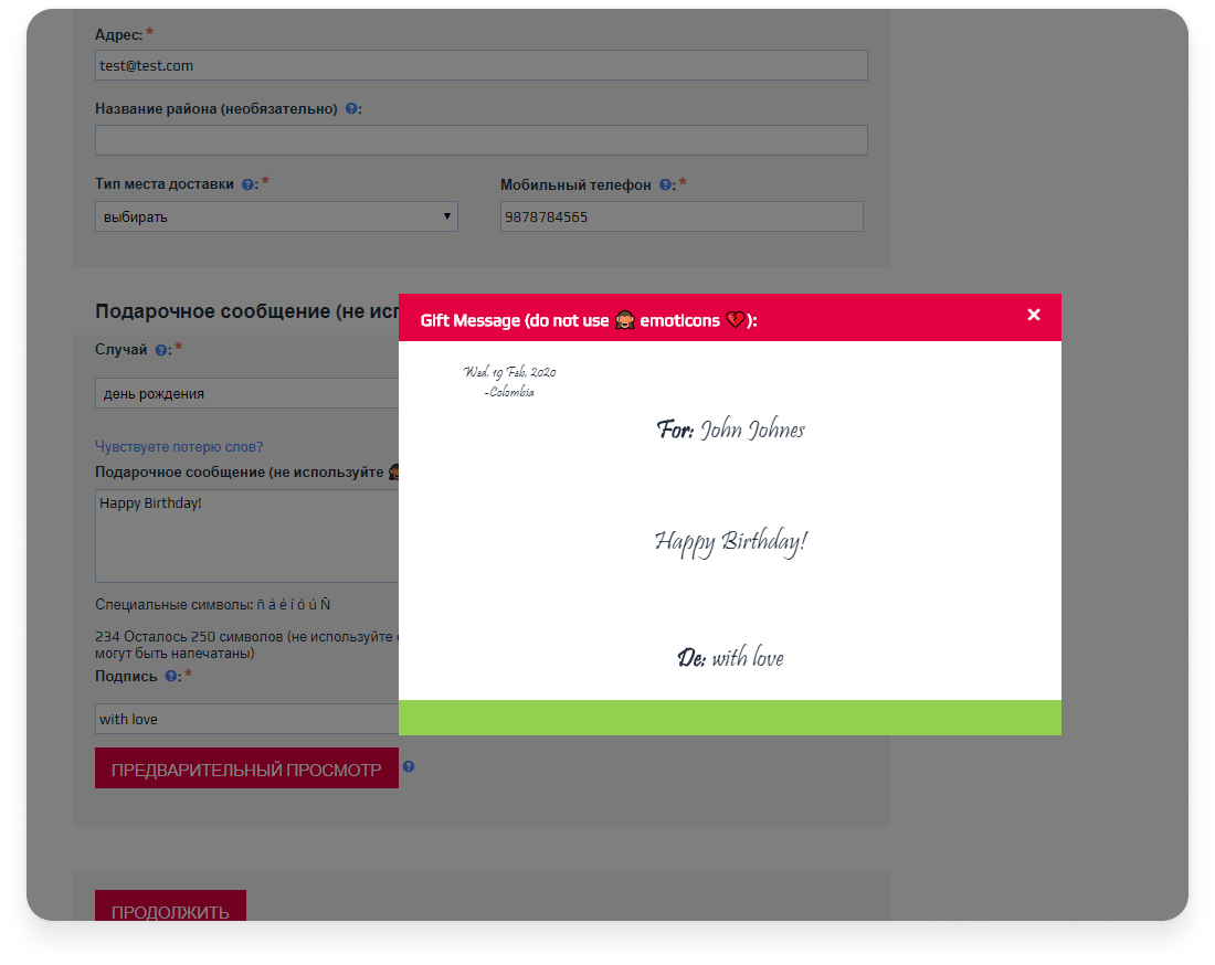
Cards with wishes that can be put into the flower arrangements are very popular. Previously, the buyers could only choose from a list of ready-made postcards with preset text templates. We have added a special form to the checkout which allows the buyer to create postcards with their own texts.

When the buyer places an order, he can fill in the name of the recipient, the text of the message, add emoticons and a postscript. Floristería administrators will print this on a postcard and put it in a bouquet. The nice thing is that the buyer will be able to preview and make sure everything looks exactly the way they want.

2. We combined cart and checkout

By default, in CS-Cart, the cart and checkout are two different pages. We combined them into one: this reduces the number of steps that the buyer needs to go through to complete the order. As a result, fewer customers abandon their carts.

Floristeria объединили корзину и чекаут
3. Improved design for user’s convenience

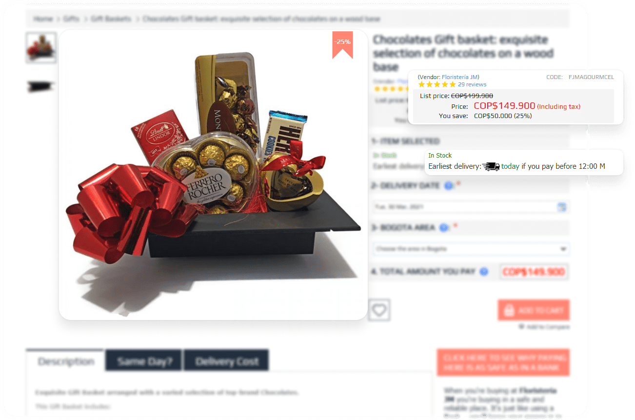
All changes have their goal to make choosing products and placing orders more convenient for the buyer.

Floristeria дизайн
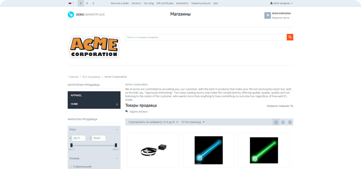
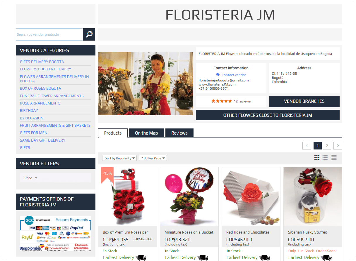
In the BogotaCompra marketplace, we have improved the vendor’s page
This is how it looks in the default version of CS-Cart Multi-Vendor
This is how vendor's page looks now

As you can see, the design has changed beyond recognition. Buyers especially like the fact that the payment methods available to the vendor and contact details and ratings are immediately visible.

4. We added extended reviews

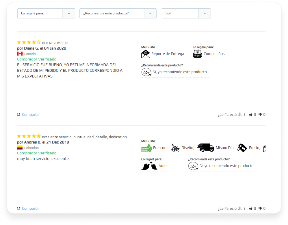
We linked the Cart-Power: Power Reviews add-on and Stamped.io – a software platform for collecting reviews and user-generated content. Reviews from Stamped.io are automatically loaded into a special block.

Thanks to this service it became possible to evaluate the details of the order. The buyer can write a review and note, for example, that he especially liked the speed of delivery and the bouquet design. The noted benefits of the product are illustrated with icons and attract the attention of store visitors.

Floristeria расширенные отзывы
5. We optimized CS-Cart loading speed

This is what lazy loading looks like on the site. The list of products loads quickly, but all the images are in place and appear as you scroll the page.

By default, CS-Cart loads all images on any page of an online store at the same time. The client has up to 100 images on some category pages, which significantly reduces the download speed.

Our Cart-Power: Lazy Load for Images and Blocks add-on solved this problem. Its main idea is to delay the loading of everything that the user does not need right now.
The images are not loaded immediately when the page is opened, but only when scrolled. This helped to improve performance and use device resources sparingly.

Our work results

Services

Functionality Development
Speed and Performance Optimization
Online Store Redesign

We will find solutions for everyone

Share your idea and we’ll offer an optimal solution

Please, fill out the form