
Loopazon: A Story About How Website Redesign Affects SEO
Field: Digital products Country: USA Website: Loopazon
Problem and Objectives
The client was concerned about the site’s visibility in search engines, there were difficulties in attracting new clients. He approached us for an SEO audit and promotion.
When analyzing the current site we have identified a number of problems that could significantly reduce the effectiveness of any SEO strategies.
The current design was outdated, non-responsive and not optimized for search engines. This created a poor user experience, made navigation difficult and reduced the chances of attracting the target audience. Search engines like Google place a lot of emphasis on the quality of user experience, page loading speed, technical aspects and page content, and therefore have a significant impact on SEO. Without changing the site design, the risk of wasting budget and not getting any results was very high.
We saw the redesign as an important step towards successful SEO promotion and achieving the client’s goals.
What We Did
We focused on a modern, simple design that would make navigation easier and help users find the right files, download or upload their own. Minimalism and simplicity of design became the key principles of our solution. We have also updated the fonts and icons to match the common style of the site.
Our goal was to improve the visual impression, make the site more attractive for users and adapt it to any device.
Homepage
Before
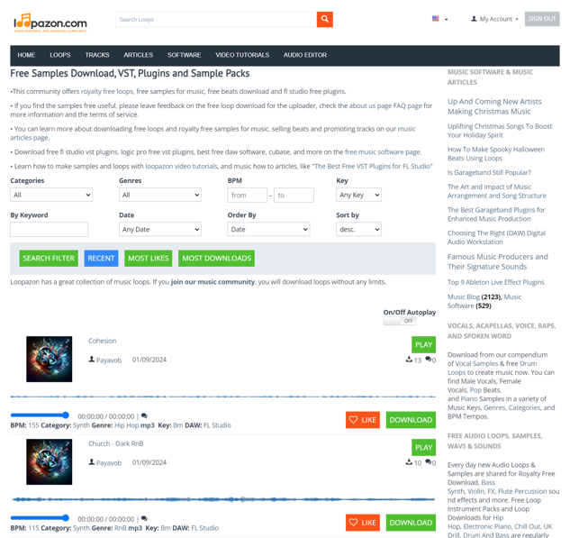
This is how the homepage looked before the changes. The user was confused and distracted by the amount of tags and links. There was a large block of text that could scare the visitor away with its size. The site was visually unattractive and difficult to navigate.
After
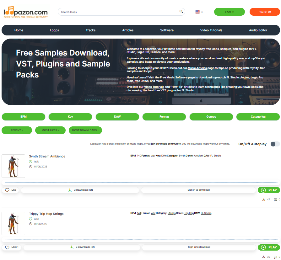
The Нomepage now looks much more presentable, there is no more visual waste on it. The text has become part of the graphic banner with a highlighted USP. The music samples are made in a single style, and the buttons complement the design. The structure of the elements on the page is simple and clear, it is easy for the user to navigate it.
Filters and Sorting
Thanks to filters and easy sorting users no longer have to browse through a huge number of files – find and download the desired music in seconds. The search filter will help the customer to select music according to given criteria – genre, musical instrument, release date, popularity and other features.
Before
After
The block with search and sorting filters fits perfectly into the overall design of the site – it has become more airy and minimalistic.


Product Page

Before
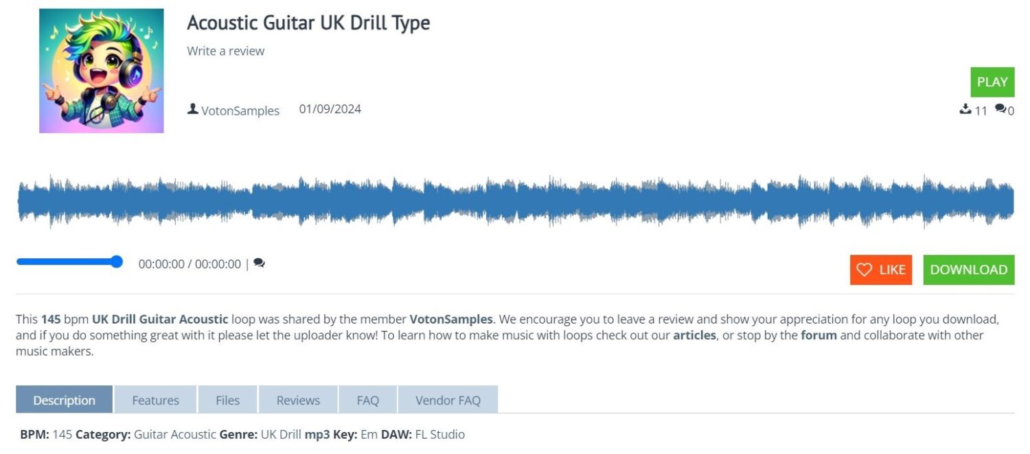
So the product card looked like before the redesign: the rectangular buttons were something outdated and strict, the large picture and soundtrack drew all the attention to themselves and interfered with the overall perception.
After
A neat, modern product card: rounded buttons with shadows create a sense of depth and volume on the screen, which adds realism and appeal to the design. No extra elements and visual noise.
Audio Editor
Before
The overall look of the audio editor matched the design of the old site – sharp rectangular shapes, monotonous buttons with hard-to-read text and icons.
After
After the changes we made, the audio editor elements became smoother and rounded. The buttons no longer merge with each other – they are logically grouped in the working area and painted in colors that are associated with their functions.


Personal Account
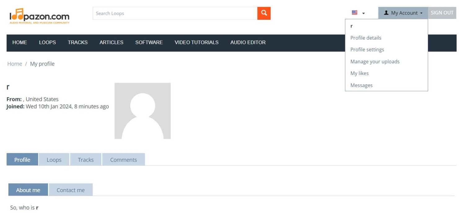
Before
The design of the user’s personal account was not changed and corresponded to the default appearance of CS-Cart.
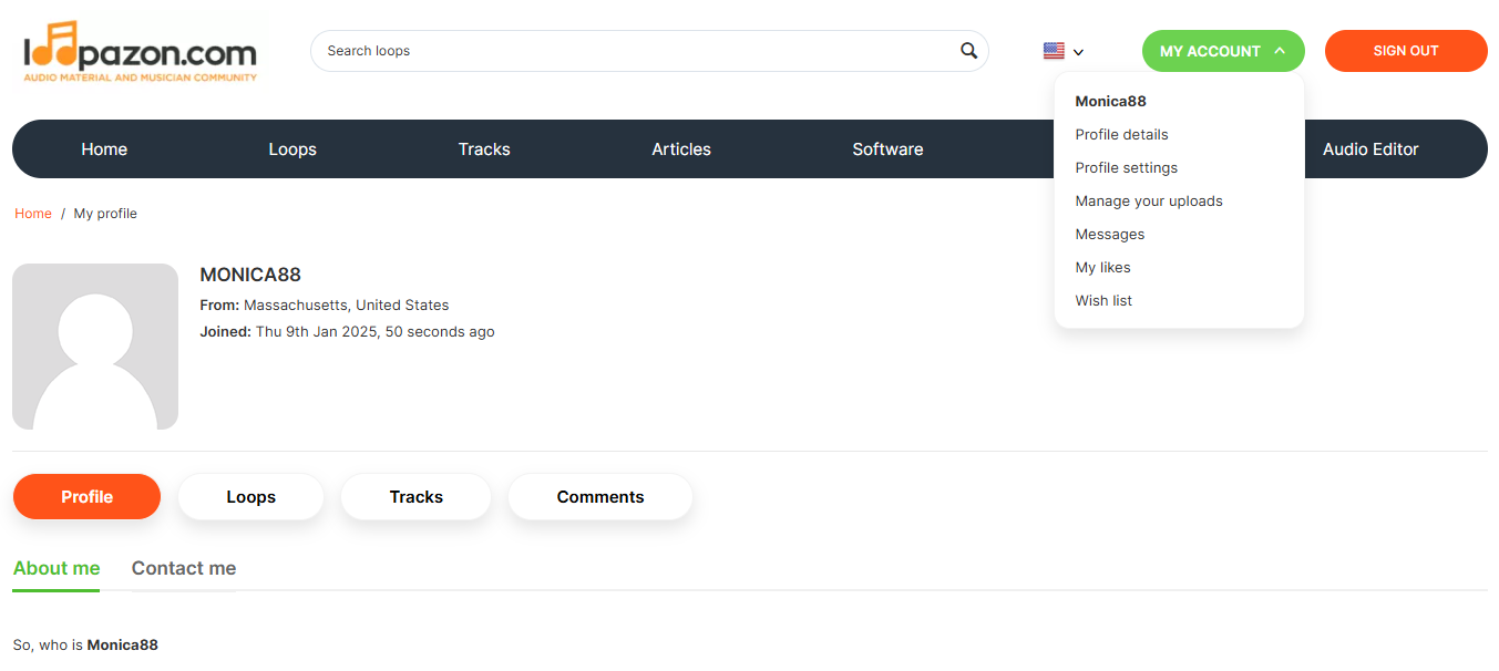
After
The user profile’s appearance matches the new site design – soft button shapes, bright color accents on active sections and a more organic arrangement of elements on the page.
Adaptive Design
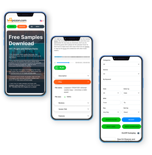
When loading the site on mobile devices, there were problems with the layout: the text was cut off, buttons moved, some elements overlapped each other. In general, user interaction with the interface was difficult.
Successful SEO promotion required correct adaptive design. It ensures optimal display on various devices, improves loading speed, reduces bounce rates and improves user experience. This increases the visibility of the site in mobile search results, improves behavioral factors and affects the ranking of the site in search engines.
Now the site is displayed correctly on different devices and screen resolutions.
Our Work Results
The redesign played an important role in preparing the platform for SEO promotion, because it:
- Improved the user experience. The new design simplified navigation, making the site intuitively understandable for visitors. This led to an increase in the time spent browsing the site and a decrease in the bounce rate.
- Optimized the boot speed. The site redesign helped reduce page loading time, which has a positive effect on SEO indicators, since speed is an important ranking factor.
- Helped optimize website maintenance costs. Initially, the website supported a large number of languages and the client spent money on this service. Traffic analysis showed that these costs were ineffective and the number of languages on the website now corresponds to the real needs of its visitors.
- Provided an adaptive version for mobile devices. The new design made the site fully optimized. This is key for SEO, given the significant increase in mobile traffic.
- Improved the site structure and meta tags. During the redesign, we revised the site structure, including the correct use of headings, meta tags, and other metadata. This helped improve the understanding of the content by search engines.
- Improved visual appeal. The new design made the site more attractive to visitors, which increased the likelihood of getting backlinks and positive reviews. This has a positive effect on SEO ranking.
The website redesign prepared the basis for high-quality SEO promotion and target audience engagement. As a result, in just 6 months of the updated website operation, the client received the following key performance indicators (on average):
- Visits: Increased 5.62 times, from 58,165 to 326,922
- Visitors: Increased 4.97 times, from 38,664 to 192,272
- Bounce rate (normal 15%): Decreased from 16.2% to 15.6%
We will help you get to the top of search results.
We check online stores for performance, find mistakes, and get your store ready for promotion.
We’ll create a relevant design, renew site structure and make a clear interface. Adjust your store to current business goals!
Add new capacities to your business. Extend functionality for current needs and fix old bugs.

We will find solutions for everyone!
Share your idea and we’ll offer an optimal solution


