10
years in Ecommerce
sales@cart-power.com
HomeCase StudyMode — New Zealand Apparel Marketplace

Mode —
MARKETPLACE SELLING CLOTHES AND SHOES

Modern design, user-friendly interface on any device and enhanced sales promotion

The MODE marketplace brings together the best New Zealand fashion boutiques in one place. It offers a huge selection of clothes, shoes and accessories. If the order contains products from two or more boutiques, they are delivered to the buyer separately from different addresses. At the same time, it is convenient that the buyer still makes one payment and manages one order in the personal account of the marketplace.

MODE логотип

Field: clothes and shoes sales   Country: New Zealand  
Website MODE

MODE главная

Main goals

When we engaged in the Mode project, it had been already successfully operating in the New Zealand market for several years, but the client did not like the look of the site. It needed to be made more modern. It was convenient to make purchases on the marketplace only through a computer, since it had neither a mobile version nor an adaptive layout.

TASKS:

Our work plan:

1. Design improvements
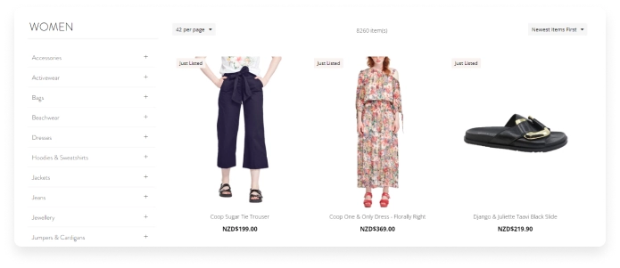
  • Pleasant colors of design, a lot of “air” and space. Mild colors soften the design, maintain a minimalistic style and visual comfort for the user.
mode
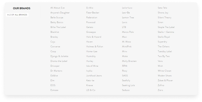
  • If a customer is looking for clothes from a specific New Zealand brand, it is convenient to do so on the page where they are listed in alphabetical order.
mode2
  • We added a page with a list of offline boutiques. If the buyer wants to try on clothes in person, he can choose the appropriate boutique and find out its address and phone number.
mode3
  • The product page ideally presents it and motivates you to buy: attractive large photos that can be zoomed in; “add a product to favorites” and “compare” features; a noticeable “add to cart” button.
mode3
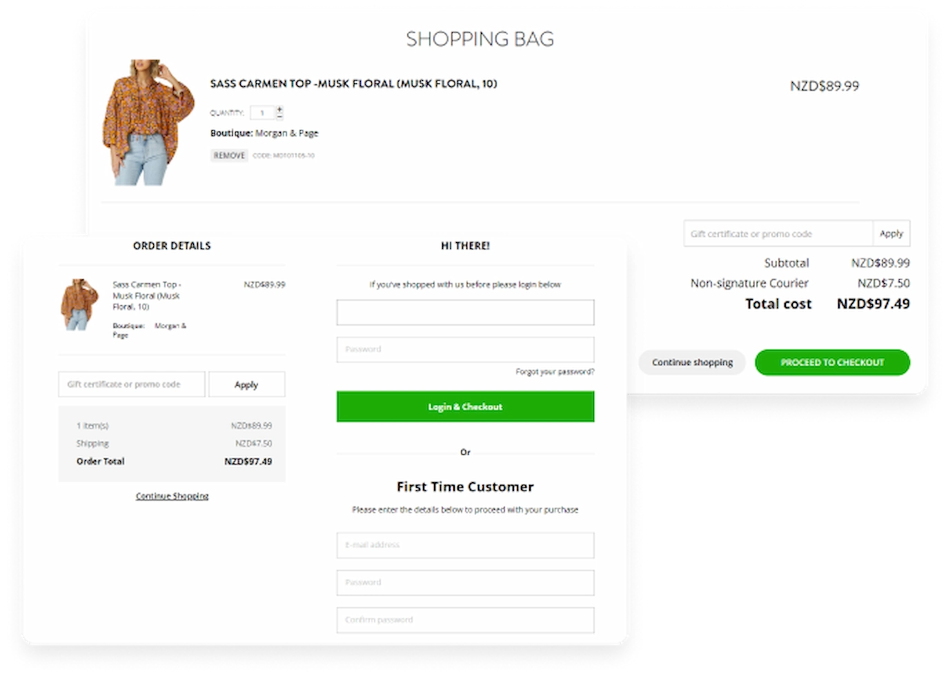
  • There is nothing superfluous in the cart functionality, which means that it will be easy for the buyer to continue the order.
  • One-page intuitive checkout: the fewer clicks – the less chance of abandoned carts.
mode4
  • Easy navigation through categories. There are breadcrumbs at the top of the product page and below the detail image, we’ve added a list of all the categories the product is in. You can navigate through them with one click.
mode5
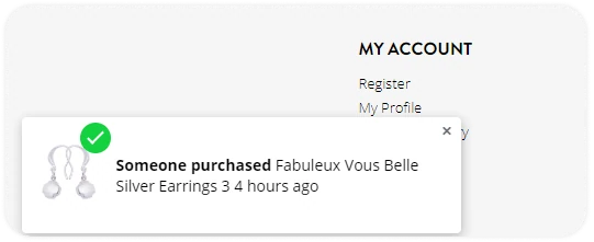
  • We have added a pop-up window that notifies you of recent orders in the online store to encourage sales.
mode6
2. Adaptive layout

We completely redesigned the layout to be adaptive. This means a flexible site layout that adapts to the screen size of the user’s device. Thanks to the adaptive layout, the marketplace now looks great and works well both on the desktop and on any mobile device. This is very important, because right now the users go to online stores most often from their smartphones.

MODE отображение на мобильных устройствах
3. Integration of installment services

We have integrated two installment calculation services in order to motivate users to make purchases, even if they have a limited budget. The monthly payment for each product is calculated in real time. A block was added on the product page where the user can view the installment terms for each service and choose the one that is more profitable for him. Shopping just got a lot easier.
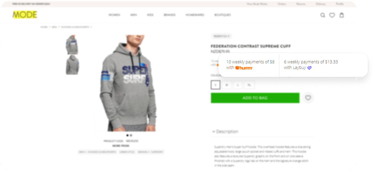
MODE рассрочка

Our work results:

Services

Functionality Development
Online Store Redesign

We will find solutions for everyone

Share your idea and we’ll offer an optimal solution

Please, fill out the form