herbariasoap.com
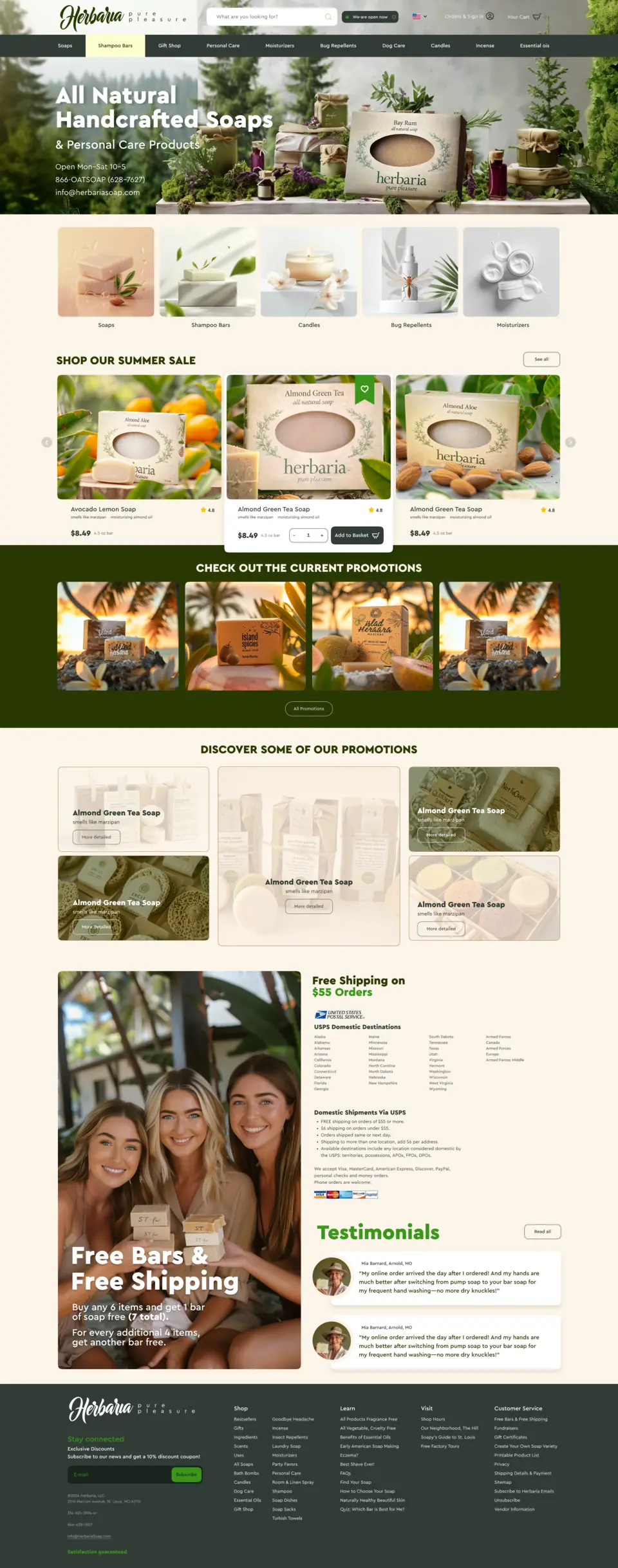
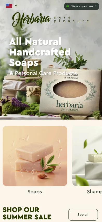
Herbaria
Natural cosmetics online store · USA
13 desktop screens · 7 mobile · 2024
Mobile app design · 2023
A marketplace for car audio, amplifiers and accessories. We fully redesigned the standard CS-Cart mobile app: the customer journey from the home page to a CDEK pickup point, sign-in, the account and five color schemes to choose from.
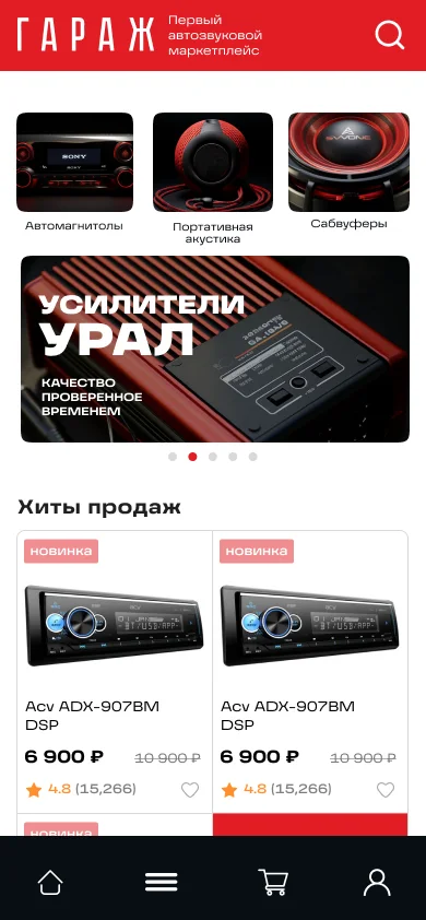
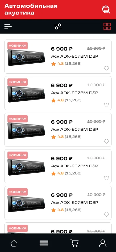
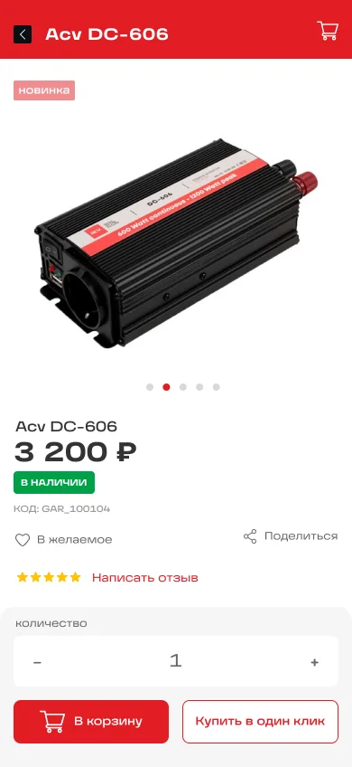
The store ran on the standard CS-Cart mobile app, and the client was not happy with its interface. They needed a new design based on the store’s website: attractive, but without extra complexity.
First we showed the client five color schemes. Then we designed the home page, catalog, product page and the other screens. Our developers rebuilt the standard CS-Cart app from these mockups.
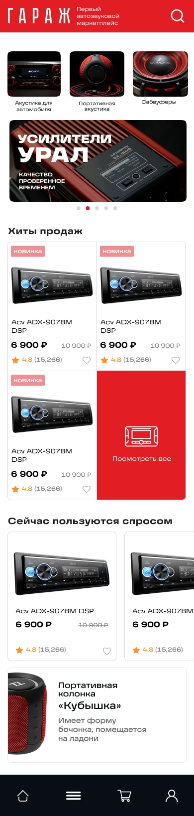
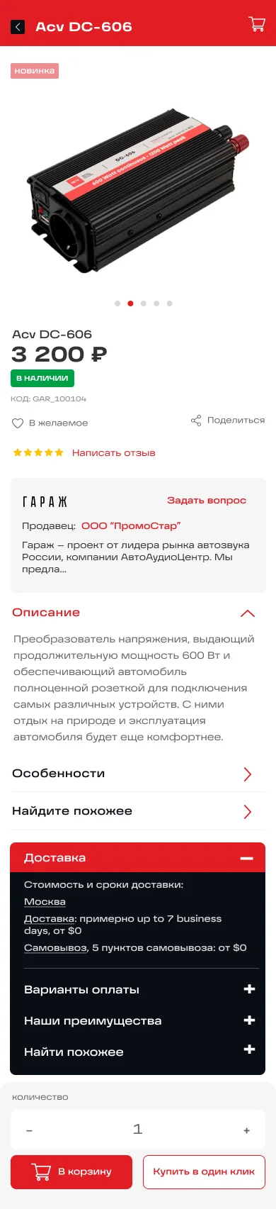
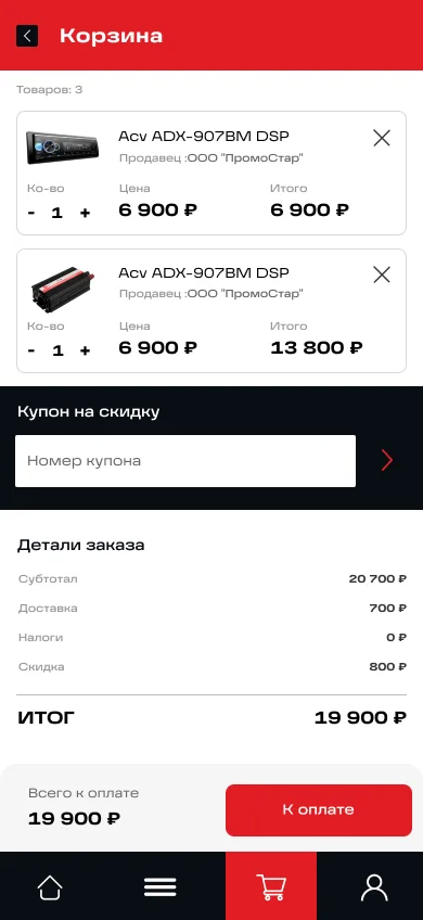
Home, catalog, product page, cart and order confirmation. At the bottom of every screen there is a four-button menu: home, catalog, cart and account.
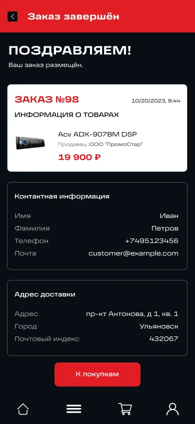
Three steps with tabs at the top: profile, delivery and payment. A completed step turns green.
First name, last name, phone and email, plus a checkbox for orders from a company.
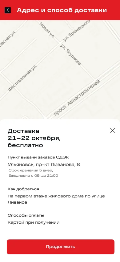
CDEK delivery with price and terms, or free pickup. The selected pickup point appears under CDEK.
A CDEK point on the map: delivery days, storage period, opening hours, directions and payment options.
Card or order by phone, a comment field and the total next to the “Place order” button.
Users sign in with email or through Google and VK. The account holds the wishlist, orders and profile settings.
Logo on a dark background, email sign-in, account creation and social sign-in.
Wishlist, orders and profile at the top. Below them: contacts, store information and free returns.
The card color shows the status: white for open, green for completed, gray for canceled.
Products with prices and a delete icon on each, plus one more delete icon in the header.
Before the mockups we showed the client five schemes: base colors, buttons in three states on light and dark backgrounds, and an illustration to set the mood. The app uses the palette of the first scheme. During approval we made the red brighter.
We designed an app icon with a speaker and a splash screen in red and white versions. Buttons, toggles and icons went into the first part of a UI kit, in default and pressed states.

Share your idea and we’ll offer an optimal solution