13
years in Ecommerce
sales@cart-power.com
HomeCase StudyCET Group: toner and printer parts store redesign

Online store redesign · 2024–2026

CET Group

A manufacturer of toner and parts for printers and MFPs. We designed a new site on the UniTheme2 theme during the CS-Cart upgrade, then kept building on it: brought it to the Kazakhstan site, updated it for the new logo and designed a new product page.

Client
CET Group, printer parts and supplies
Task
Redesign during the move to UniTheme2
Platform
CS-Cart 4.18, then 4.20, UniTheme2 theme
Sites
cetgroupco.ru and cetgroupco.kz
Years
2024–2026
cetgroupco.ru
CET Group home page mockup

Task

The site ran on CS-Cart 4.5.1, and current add-ons and themes no longer worked on that version. CET Group does not sell directly: customers order from partner dealers, so they need to see which dealer near them has the part.

We built the new design on UniTheme2 and kept the familiar style of the old site: yellow and orange accents, dark blue text. Later the design grew with the site: a new logo in 2025, a new product page and a “Useful materials” block in 2026.

Before and after

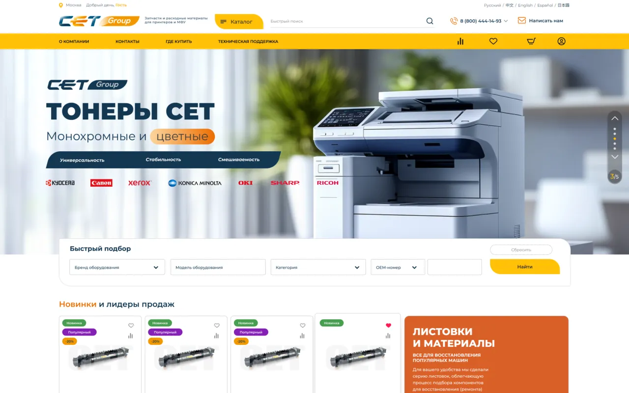
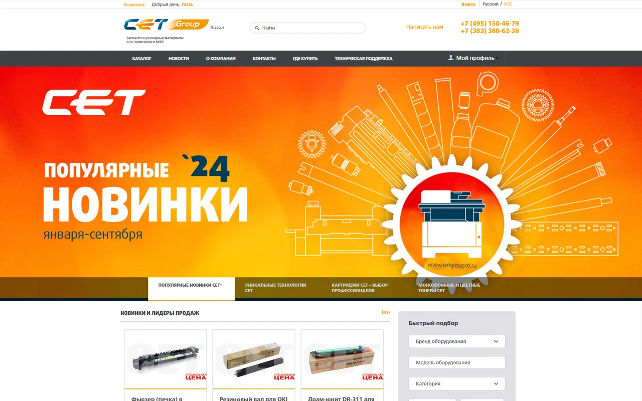
The first screen: the site before the redesign (a 2024 snapshot from the mockup file) and the new home page, both 1280 pixels wide. Drag the divider.
Mockup Before · 2024 Before · 2024 Mockup

Home page

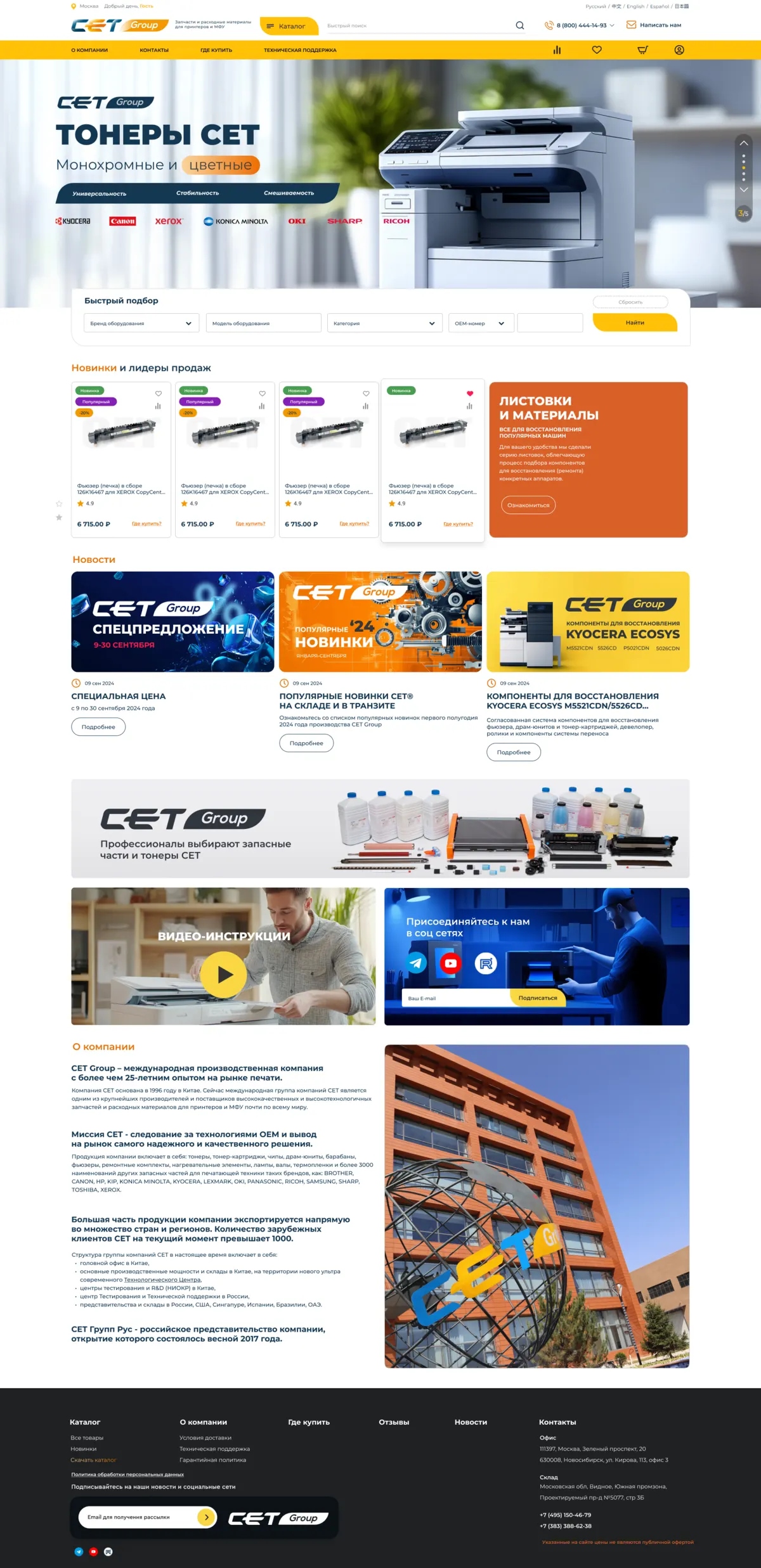
  • The header has a Catalog button, search, a phone number and a switcher for five languages. The menu sits on a yellow strip.
  • The first screen shows CET toners and equipment brand logos: Kyocera, Canon, Xerox, Konica Minolta, OKI, Sharp, Ricoh.
  • Below the slider, a quick finder by device brand and model, category and OEM number.
  • Products in the new arrivals strip have a “Where to buy?” link instead of a cart button, because people buy from partners.
  • Further down: news, video guides, a newsletter signup and a section about the company.
1920 × 3959 · Home page

Product page

  • Under the price, a “Where to buy?” button and the partners near the buyer who have the product.
  • Each partner shows its city, stock level and a link to its site.
  • The “Useful materials” block holds PDF guides, articles and videos. A button expands the full list.
  • At the bottom: specifications and products recommended with this one.
1840 × 2642 · Product page

Product page variants

We designed the product page for items with a choice of weight and page yield, and for items where the color is picked by photo with a color stripe, plus a window with the list of variants. For Kazakhstan: prices in tenge and a WhatsApp Business button instead of the cart.

1629 × 1275 · Weight and yield
1662 × 1254 · Color
1673 × 1228 · Variant list
1754 × 1243 · Kazakhstan

Mobile version

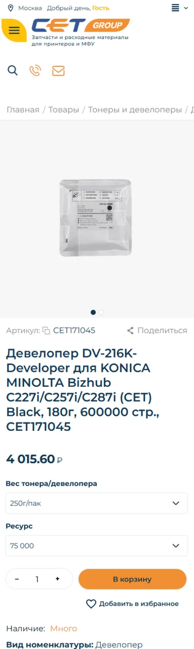
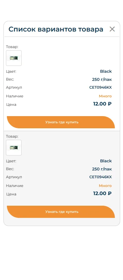
We designed the mobile screens along with each update: the Kazakhstan home page with a customer logo strip, the product page and the variant list.
Home, Kazakhstan
393 × 2341 · Home, Kazakhstan
Product page
385 × 1282 · Product page
Variant list
393 × 897 · Variant list

Finding the style

Besides the final home page, the mockup file has a dark concept and two light variants: one with the menu in the top bar and one with the catalog in the yellow strip.
1920 × 2240 · Dark concept
1920 × 3939 · Menu in the top bar
1920 × 3959 · Catalog in the strip

Mockup colors

  • #FFC107Menu and buttons
  • #D96028Accent blocks
  • #133752Text and labels
  • #1E2122Footer
  • #FFFFFFBackground and cards

More

More projects

All design projects

We will find solutions
for everyone!

Share your idea and we’ll offer an optimal solution
Please, fill out the form